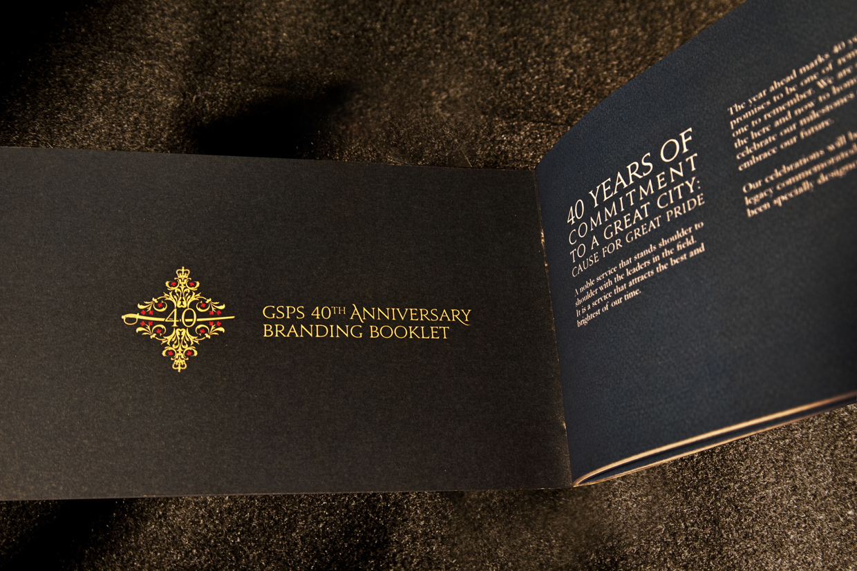
Branding
Client:
Greater Sudbury Police Service
Brief:
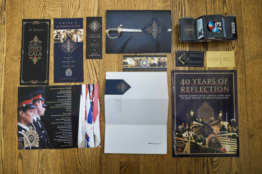
To mark their 40th Anniversary, the Sudbury Police commissioned a variety of corporate communications materials:
- Logo and Branding Guide
- Editorial Design
- Photography
- Products
Logo
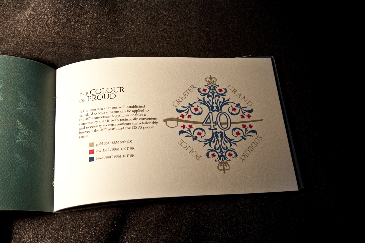
Inspiration for the logo came from archival documents retrieved in the city of Sudbury Archives. Credit to Amanda Thirkill for retrieving and identifying key design cues.
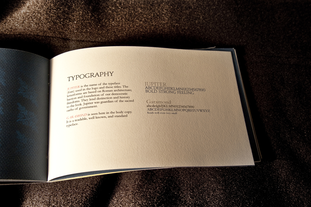
- Typeface "Jupiter": From the Canada Type foundry, Jupiter conveys history and order, but also familiarity and civic pride.
- The Sword: Queen Elizabeth II presented this ceremonial sword when the Sudbury Police Service was founded.
- The Floral Design: The floral design represents growth and care. It represents beauty and the people of Sudbury, who granted the Police Service their authority, and who the police serve.
- The Crown: The Crown is the symbol of the state, from whom part of the Service's authority is granted.
- Upper Maple Leafs: The 8 maple leafs on the top half represent the 8 officers who had, at the time of the 40th, fallen in the line of duty.
- Lower Maple Leafs: The 8 maple leafs on the lower half represent the 8 police services that amalgamated to form GSPS in 1973.
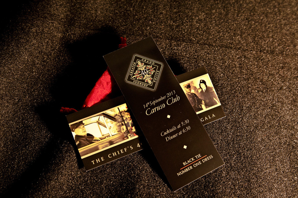
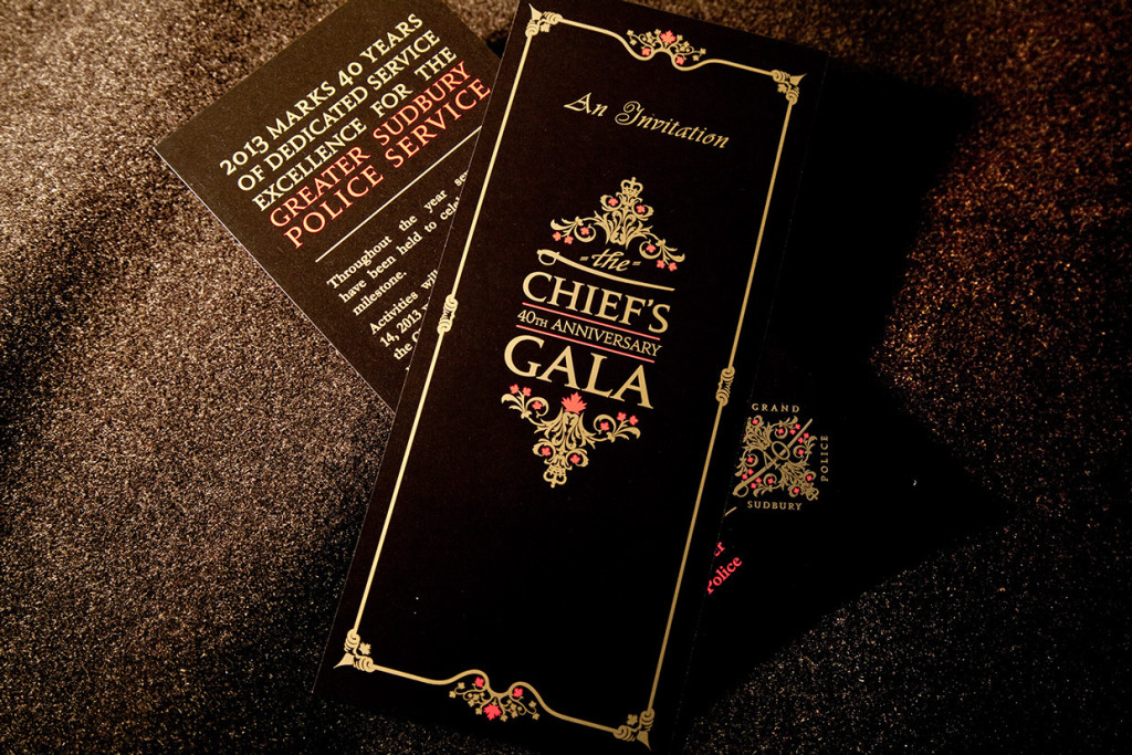
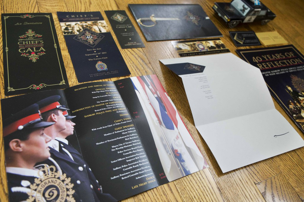
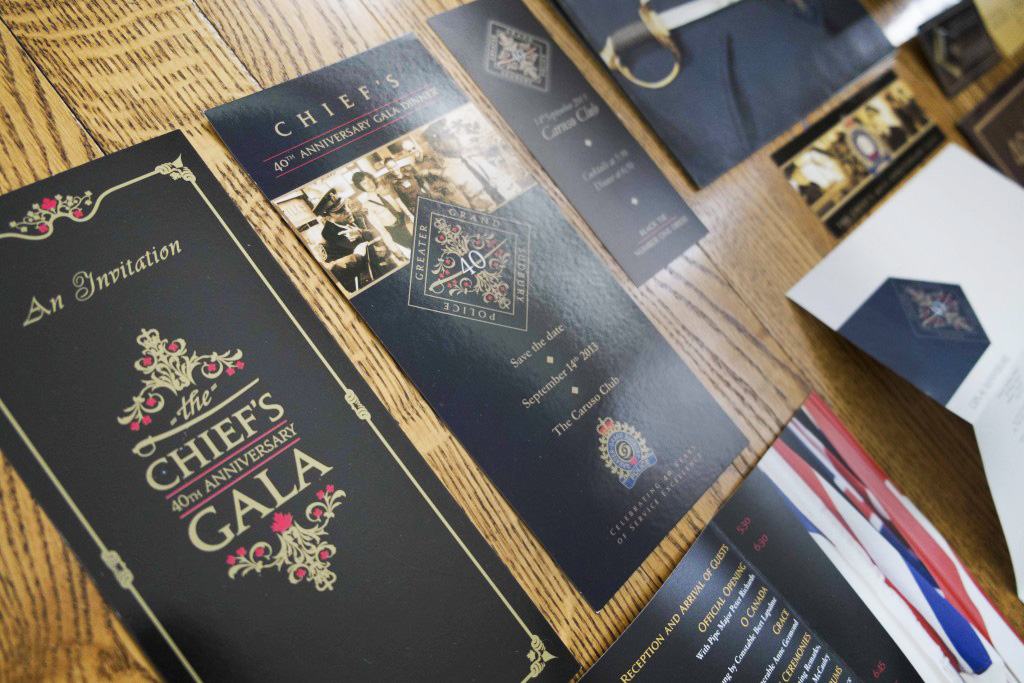
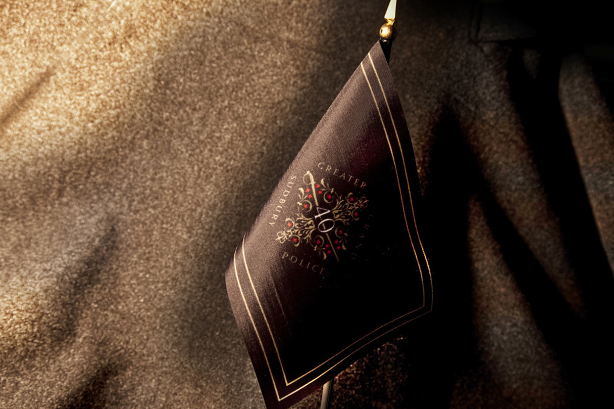
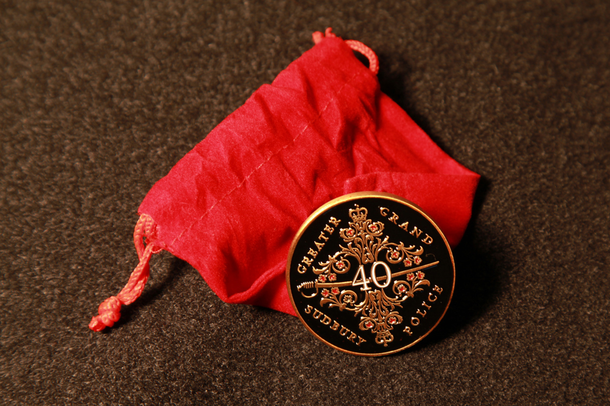
Marketing Materials
- Invitations
- Tickets
- Awards
- Letterheads
- Giveaways
- Event branding
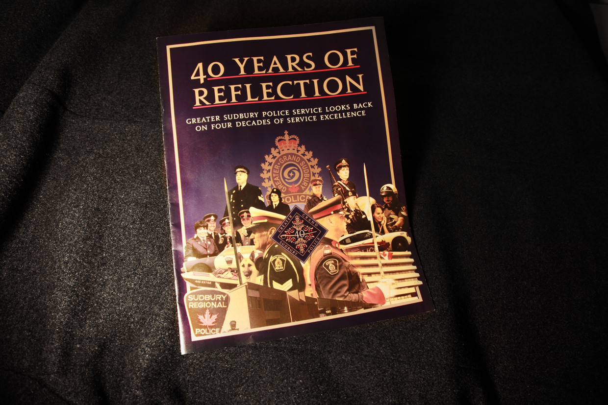
Editorial Design
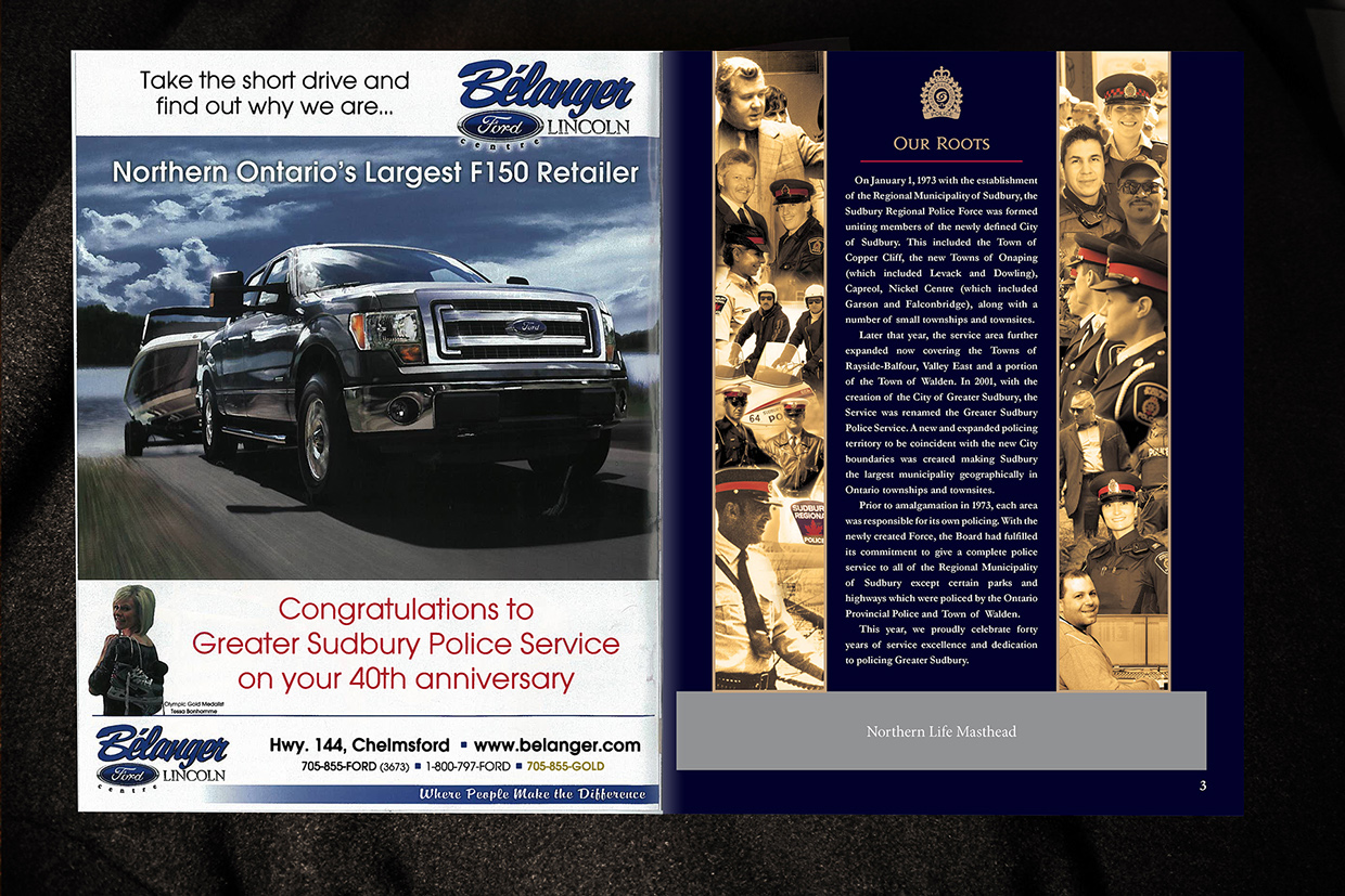
The Northern Life (now Sudbury.com) offered a publishing partnership to create a one-time celebratory magazine that was delivered to all Northern Life Subscribers.
The goal was to tell the story of policing in Sudbury so far, and the plan for the future.
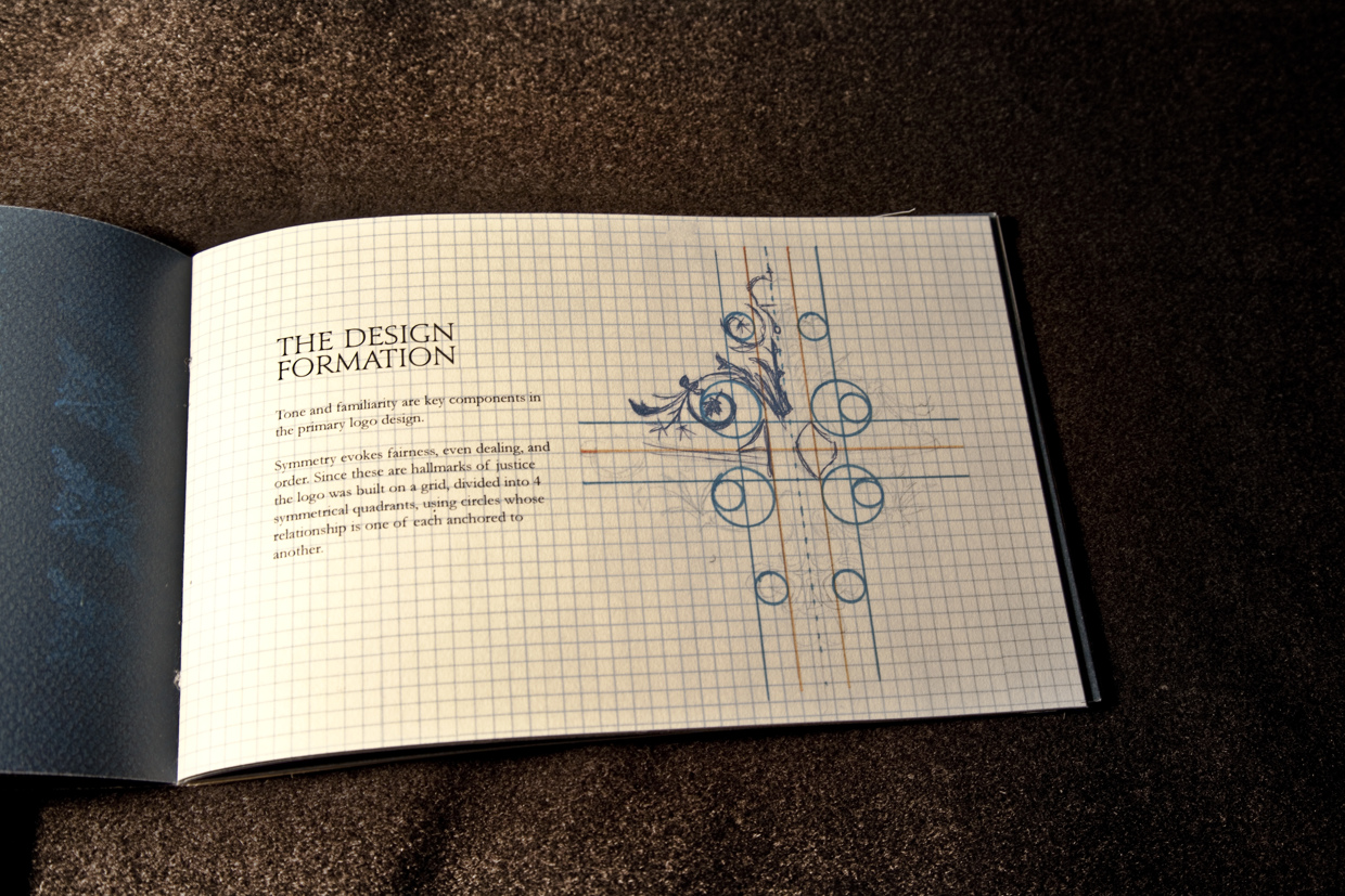
Brand Guidelines
The Sudbury Police are part of a hub of services under the City of Sudbury and associated with various groups at the community and provincial level.
This brand guide was developed to enable correct brand use externally and internally,
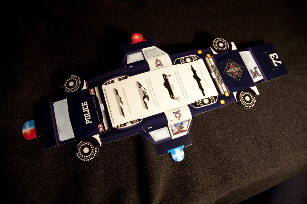
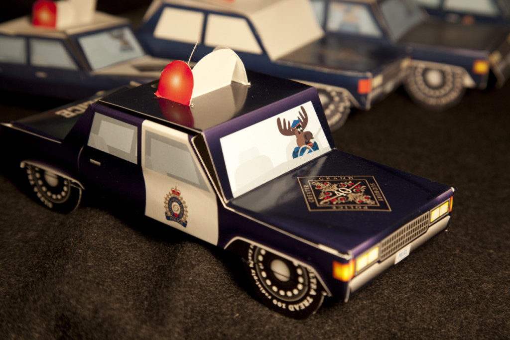
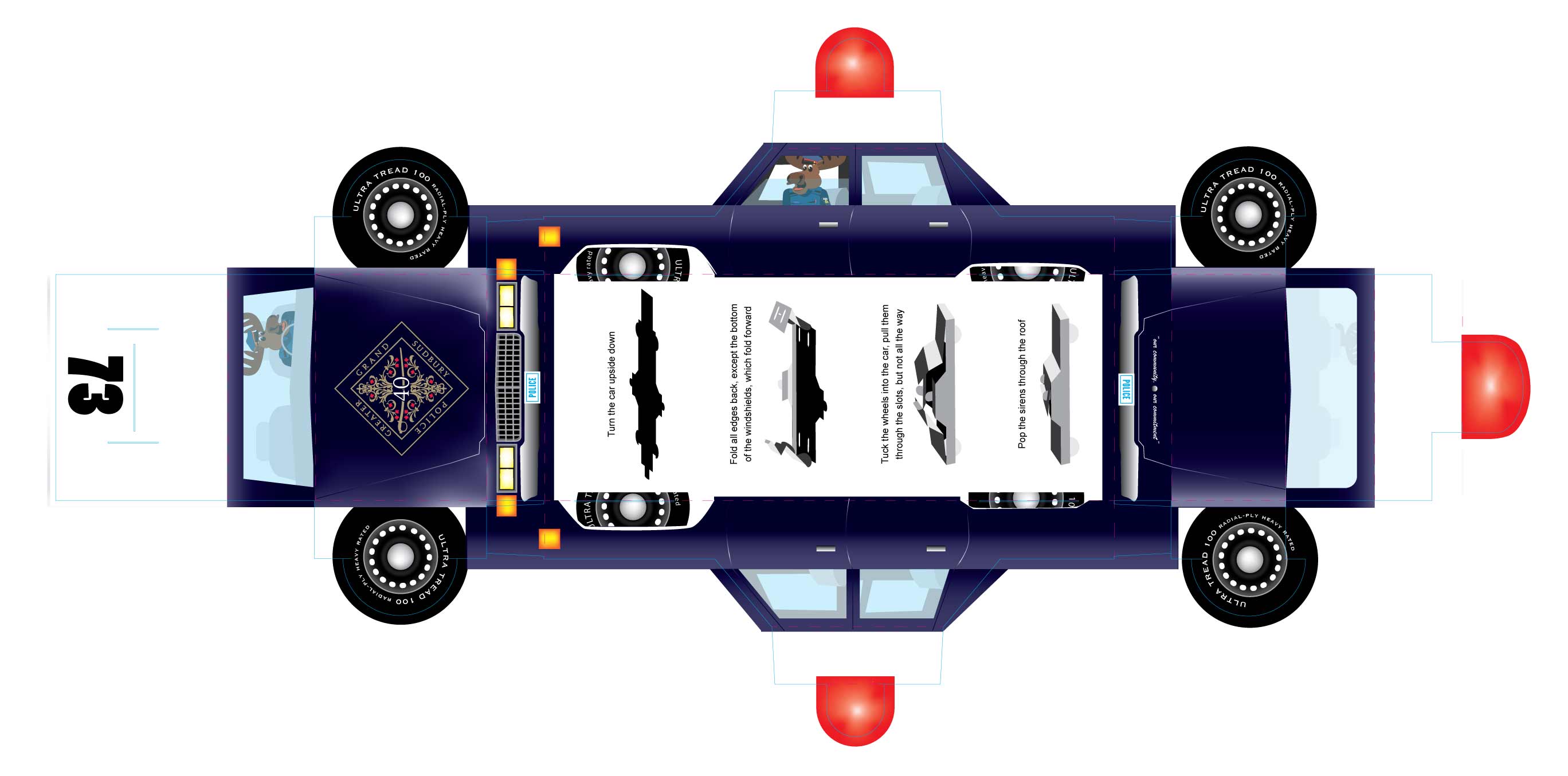
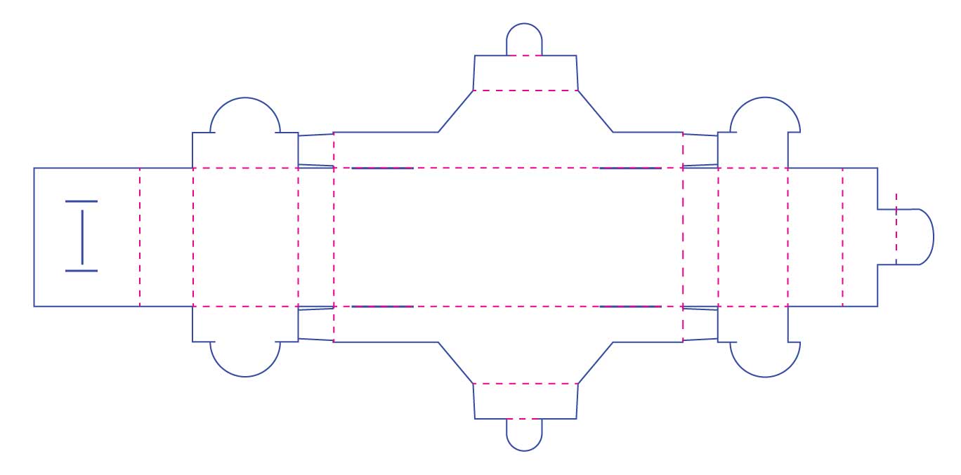
Paper Car Dieline
I created a dieline for the folding car picture below. The goal was to provide an memorable event giveaway for under $1.
Download the dieline for free
